
Nuro 3.0.7 went out on the App Store on 1 October. Most of it is about one moment: the first few minutes after you open the app for the first time. There's also a new one-line summary at the top of every entry, a redesigned bottom bar, and a round of fixes to sign-up and the subscription screens.
Here's what changed, and why.
A first day that starts with a question
One thing I kept hearing from people trying Nuro: they opened the app, saw the record button, and didn't know what to say.
That makes sense. A blank screen with a microphone asks a lot of you. You're supposed to have a thought ready, out loud, on the spot, in an app you've never used. Even people who talk to themselves all day freeze at that.
So on a brand-new account, Nuro now asks you something instead:
"What's on your mind about ___?"
The blank gets filled with a topic. If it's not the right one, tap the dice and Nuro offers a different topic. When one lands, you can Say it or Type it, whichever suits where you are.
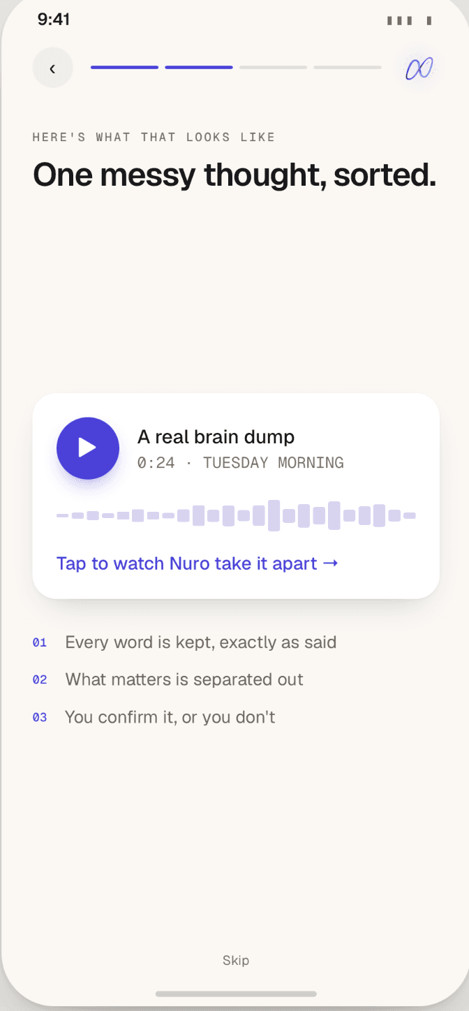
The point isn't the topic. It's that your first entry starts from somewhere, so you get to see what Nuro actually does with something you said, instead of staring at a button.
I kept this deliberately small. It's one question, not a questionnaire. You don't have to set goals or pick categories before you're allowed to talk. If you already know what you want to say, ignore the prompt and say it.
An optional short tour
If you want it, there's now a short tour that explains each part of the app. It's optional. If you'd rather just start talking, skip it.
Every entry opens with a one-line summary
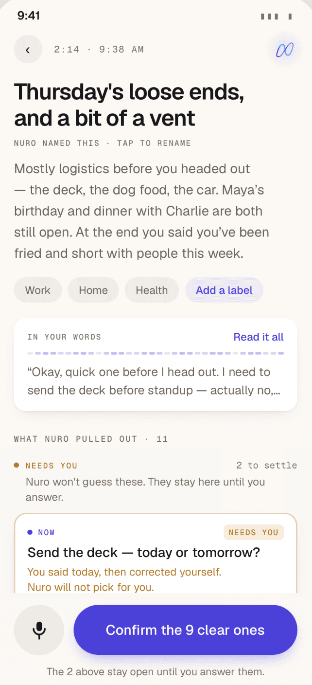
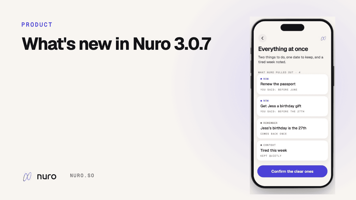
When you finish an entry, the first thing you see now is a one-line summary, written to you. Something like:
"Two things to do, one date to keep, and a tired week noted."
Underneath it are the things Nuro suggests: to-dos, things to remember, and context it keeps but never turns into a task. That part hasn't changed. Nothing lands on your list until you confirm it, and if you didn't say a date, Nuro doesn't make one up.
The summary is there so you can tell at a glance what an entry was about, especially when you scroll back through a week of them. Your full transcript and the original audio are still right there if you want to check what you actually said.
A redesigned bottom bar
The bar along the bottom of the screen has been redesigned so Home, Library and recording are easier to reach. Recording matters most here: the whole app depends on it being the easiest thing to do.
Clearer trial and subscription screens
The trial and subscription screens have been rewritten to be clearer about what you're signing up for. I also fixed some sign-up issues. Not exciting, but if you ran into one, I'm sorry, and it should be smoother now.
What hasn't changed
A few things I want to stay true in every version:
- You stay in charge of your list. Nuro suggests; you confirm, correct or dismiss.
- To-dos don't nag. No reminders on to-dos. An undated one that's been sitting for three weeks gets one "Still true?" question, once.
- Your original words are kept. Transcript and audio, next to whatever Nuro suggested, because AI can be wrong.
- What you say isn't used to train AI models, by Nuro or by OpenAI. More on that here.
Getting the update
If you already use Nuro, update from the App Store and you'll get the summary line, the new bottom bar and the fixes. The new first day is for brand-new accounts. If you've been meaning to try Nuro, this is a good version to start on.
As always, if something feels off, I'd like to hear about it.
Quest
Related reading: How Nuro works · How to brain dump · What a brain dump app is for